
Pin-Ups, Portraits and Blackletter: The Looks Behind the Designs
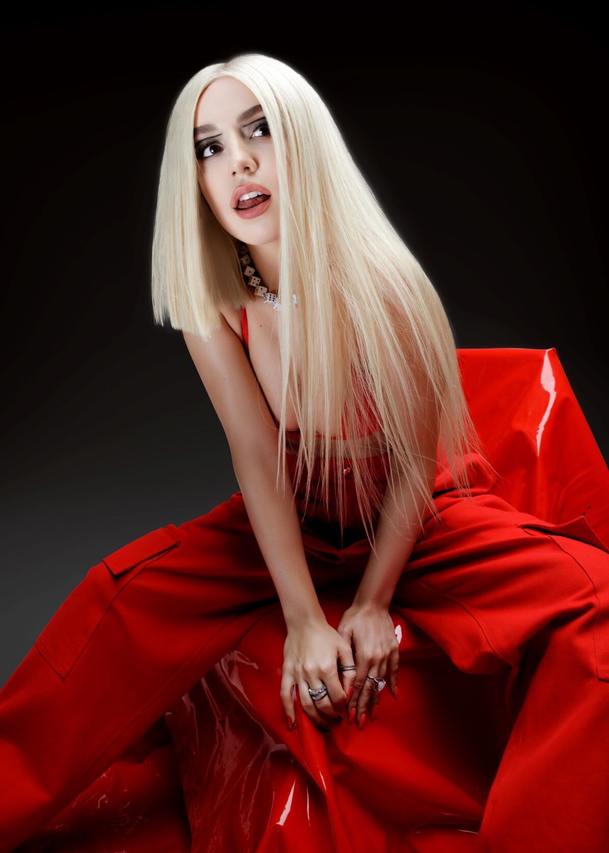
Not every design is tied to one song. Some start with a look, a slogan or a way of writing my name. Here's what is on the ones that do.
Which designs are about the look?
- Pin-Up Pink and Pin-Up Green: the same retro pin-up in two colours. A woman with a sharp fringed bob, in thigh-high boots, stretched across a row of big round shapes, all in one shade, with the glossy feel of a vintage magazine poster.
- Red Bob Portrait: a close-up of me with a blunt red-orange bob, silver eyeshadow and deep red lips on the front, and on the back red vinyl trousers and a mirrored silver block.
- Beach Polaroid: a black-and-white instant photo of me walking along the shore in a white Polaroid-style frame, with my name in sharp gothic blackletter on the back.
Which ones play with my name?
Blackletter Repeat runs my name twice over in gothic blackletter, like a banner across the chest: the darker, edgier side of the bright pop logos. Snowflake Script writes it in loose, joined-up handwriting dusted with snowflakes and sparkles, a winter-ready piece.
And the slogans?
- Heartbreak Survivor: two words in big, heavy type, for everyone who has sung their way through a break-up and come out stronger.
- Masterpiece Purple and Masterpiece Mono: the line Now I See a Masterpiece in flowing calligraphy on the front, and a portrait of me, finger to my lips, on the back. One is soft and purple-toned, the other high-contrast black and white.
Which should I pick?
Want a statement? Go for Pin-Up Pink or Green. Prefer it quiet? Beach Polaroid is a quiet snapshot. Love the moodier side? Blackletter Repeat is the one. Every design comes on tees, long sleeves, crewnecks and hoodies, with kids' and youth sizes too.